The phone over at Artsy Geek Designs rang today. It was a surprise to me because our office line (which I get through Comcast) is often unavailable when I need it. I’m always surprised when it’s working. (Btw, I hate Comcast–did you know?)
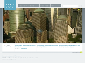
The nice fellow on the other end had some questions about our web development, and I was, of course, happy to fill him in. They’re looking for someone who can recreate the look and feel of www.wtc.com, the site devoted to the new World Trade Center.
While we spoke I checked out the site. I noted the clean lines, simple navigation, and it’s true–the front page movie was inspiring. Look what they’re going to do to Ground Zero! It will be gorgeous again!
The movie uses Flash. These people want Flash.
I have a love-hate relationship with Flash. I first fell in love with web design when I got my hands on the first version of Flash in 1995. I created some god awful stuff with it, and had a damn good time doing it.
The introduction of Flash ushered in an era where people spent thousands of dollars on long movie intros, and every site you visited had music. I hate sites with music. Seriously if any of you like sites with music, please leave a comment. I just don’t believe that anyone out there likes sites with music. I need to hear it.
Nowadays, people just skip the intros. Back in 1995, I would watch intro after intro in awe. It was a wondrous medium. It still is.Nowadays, I’m often approached by people who want Flash intros or websites. As a veteran web designer and an proponent of easy navigation, I am no longer enthralled by Flash. Many visitors have outdated Flash plug-ins and haven’t–or are scared to–upgrade. Flash movies aren’t accessible for people using screen readers. And it doesn’t work on some mobile devices–notably the iphone and the ipad.
I explain these things and then suggest that we use javascript and other tools to create something slightly different and also awesome and impressive. That can win people over, but I’m always weary. The last thing you want is a client that secretly wants Flash but isn’t saying so.
We were discussing all of this today in the context of imitating www.wtc.com and its flashy flash intro. It was becoming apparent that to please them it would be easiest to use Flash. I suggested that perhaps we could use a still image for those people without flash. At least they wouldn’t be looking at a blank page. Any good web designer would use a work around like that, right?
I looked up www.wtc.com on my iphone and wasn’t surprised to find a blank page. But, hey, the links work. All that’s missing is some of the experience. Anyway, I bet iphone users are used to it. Are you?


Leave a Reply